
Unlocking the potential of color theory can revolutionize your landscape photography, enabling you to create visually compelling images that captivate viewers. As a powerful tool, color theory provides the foundation for understanding how colors interact, complement, and contrast with one another. By mastering these principles, you can enhance your landscapes, making them more engaging and aesthetically pleasing.
At the core of color theory is the color wheel, an essential instrument that organizes colors in a circular format. This structure highlights the relationships between primary, secondary, and tertiary colors. Primary colors—red, blue, and yellow—are the purest hues, unable to be created by mixing other colors. Secondary colors, such as green, orange, and purple, result from blending primary colors, while tertiary colors emerge from mixing primary and secondary hues.
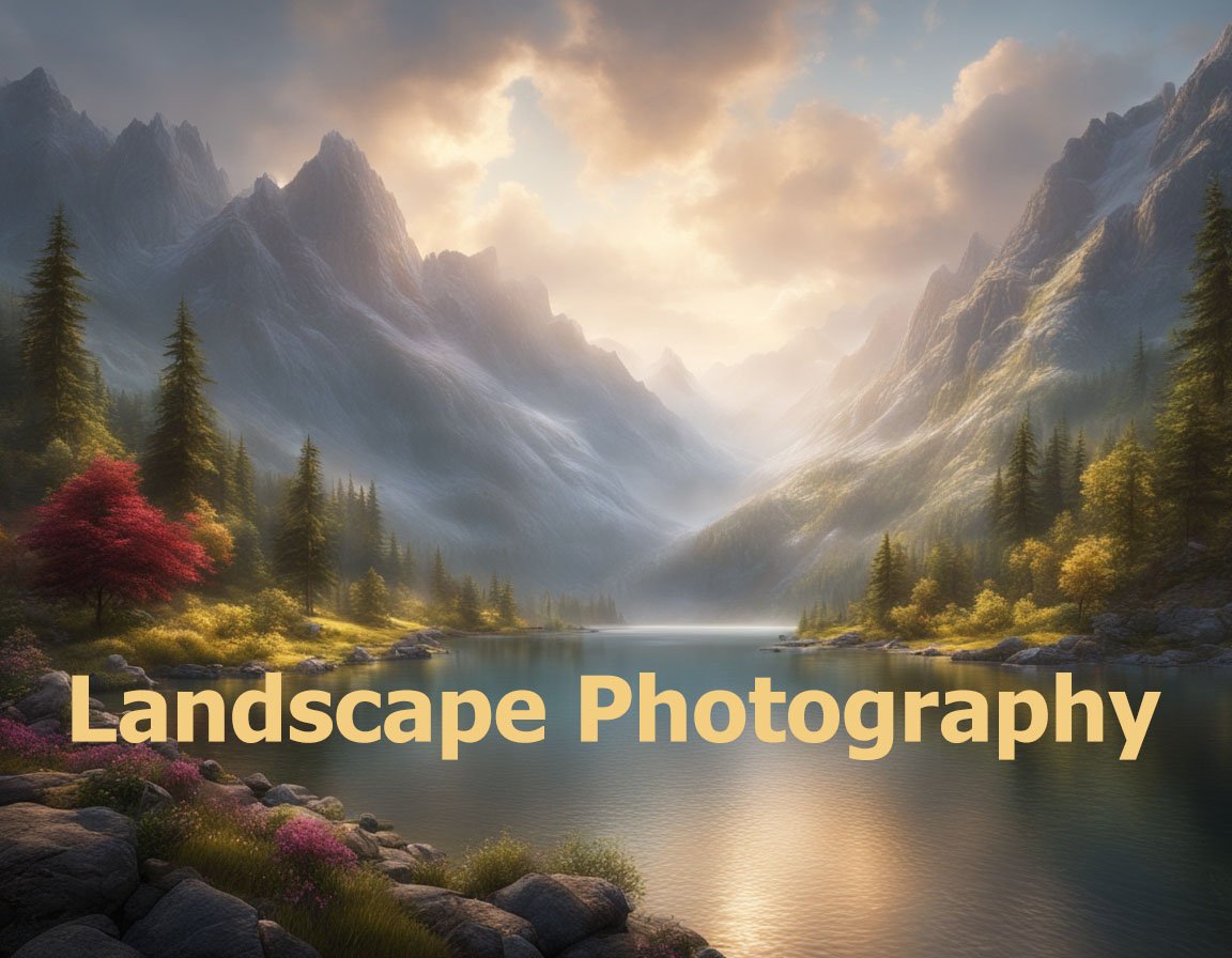
Understanding color harmony is essential for creating balance and unity in your landscapes. Color harmony refers to the pleasing arrangement of colors, evoking a sense of order and cohesion. Complementary colors, positioned opposite each other on the color wheel, offer a dynamic contrast that can add vibrancy to your photographs. For instance, a sunset landscape might feature a vivid interplay of orange and blue tones, creating a striking visual impact.
Analogous colors, which are situated next to each other on the color wheel, provide a more subtle, harmonious feel. This approach can be effective in natural landscapes, where colors gradually transition into one another, such as the varying greens of a forest scene. This gentle shift in hues can lend your photography a soothing quality, ideal for depicting tranquil environments.
The psychological impact of color should not be underestimated. Each color can evoke specific emotions and associations, influencing how viewers perceive your landscape images. Warm colors like red, orange, and yellow often convey warmth, energy, and excitement, which can invigorate a scene. Such hues are frequently present in dramatic sunsets or autumn foliage, drawing the viewer’s eye and generating an emotional response.
Conversely, cool colors such as blue, green, and purple tend to evoke feelings of calm, serenity, and introspection. These colors are prevalent in water scenes, mountainous terrains, and lush meadows, helping to create a sense of peacefulness and balance. By understanding these emotional triggers, you can intentionally choose color palettes that align with the mood you wish to convey in your landscapes.
Another critical aspect of color theory is saturation, or the intensity of a color. A highly saturated image can feel vivid and alive but may risk overwhelming the viewer if overused. In contrast, desaturated colors provide a more muted and sophisticated look, which can enhance narratives of tranquility or melancholy. Adjusting saturation levels allows you to direct the viewer’s attention subtly and effectively within the frame.
Tonal contrast, another critical concept, involves utilizing varying shades of light and dark to create depth in a photograph. By manipulating tonal values, you can emphasize the three-dimensional quality of a landscape, highlighting textures and forms. This technique can draw attention to certain elements within the composition, guiding the viewer’s eye through the image.
The phenomenon of atmospheric perspective further demonstrates the importance of understanding color in landscape photography. As distance increases in a landscape, colors fade, appearing less saturated due to the scattering of light by atmospheric particles. This natural gradient creates depth, contributing to a sense of vastness and scale. By recognizing atmospheric perspective, you can utilize it to enhance the believability and allure of your landscape images.
Effective post-processing methods can augment your understanding of color theory in landscape photography. Software tools such as Adobe Lightroom and Photoshop offer advanced capabilities for adjusting color balance, contrast, and saturation. These adjustments allow you to correct and refine the colors within your images, ensuring they match your artistic vision or meet specific aesthetic criteria. By leveraging these tools, you can produce polished, professional-quality landscape photographs.
Composing with colors requires intentionality and practice. By experimenting with different color combinations, you can develop a signature style that distinguishes your work. As you refine your ability to perceive and utilize color, your landscapes will become more impactful, resonating with viewers by evoking emotion and wonder.
By adhering to the fundamentals of color theory, you can transform your landscape photography from ordinary to extraordinary. This knowledge allows you to harness the full potential of color, creating stunning visuals that speak to the harmony and beauty inherent in the natural world.